You have probably figured out by now that I love things with a bit of pop or edge or umpf (I apologize for the highly technical language here!). Something that makes the ordinary a little less ordinary, something that makes you look twice.
Brandon Mably's cotton fabric designs certainly have umpf.
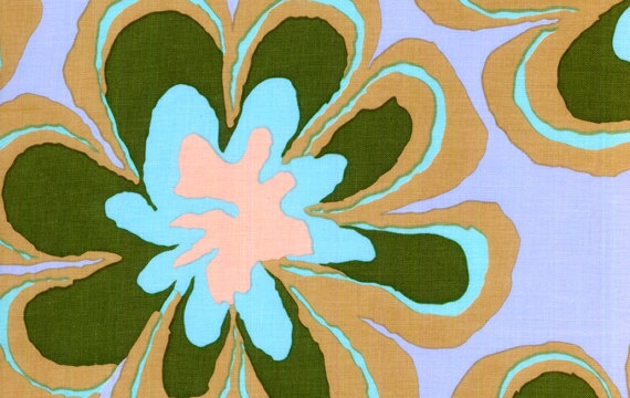 |
| Brandon Mably - Flora Grey |
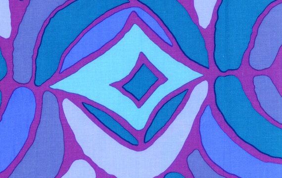 |
| Brandon Mably - Bones Blue |
 |
| Brandon Mably - Herringbone |
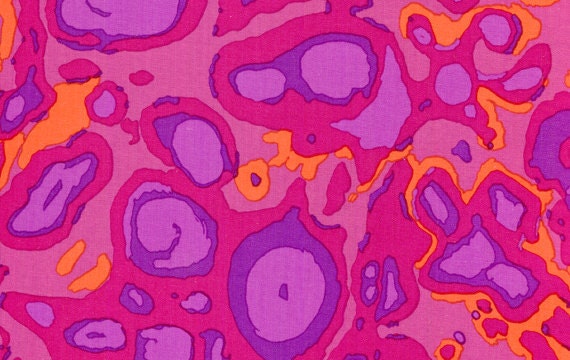 |
| Brandon Mably - Splash Orange |
I love the way he uses color contrasts and the rough edges to his lines. The fabric is beautiful without being too pretty.
I've seen folks using his fabric for kids' clothes (the dots) or quilts, but I think they would be great for women's clothes and accessories, too. You'd need to be careful - a little Brandon Mably goes a long way!
I can picture these prints as a spring/summer skirt or handbag:
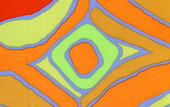 |
| Brandon Mably - Bones Yellow |
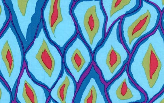 |
| Brandon Mably - Scales Blue |
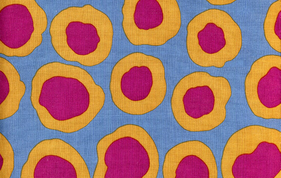 |
| Brandon Mably - Fish Lips Grey |
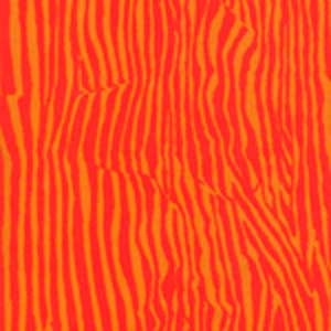 |
| Brandon Mably - Wrinkle Red |
And for the super daring I can imagine mixing up some of his fabrics for a funky tunic, like this one I made from the
Sew Serendipity tunic pattern (Amy Butler fabrics here):
I used the Scales Grey print to make bias tape trim for a skirt (see
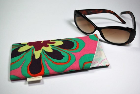
here). And here's a sunglass case I found on Etsy from seller
TheCraftQueen:
"Brandon Mably designs knitwear patterns for Vogue Knitting and Rowan Yarns, and leads workshops in knitwear design and use of colour throughout the world. For over a decade, Brandon has been the Studio Manager of
Kaffe Fassett Studio in London England, and has worked closely with Kaffe in the design, creation, and execution of knitwear, tapestry, patchwork, mosaic, and mixed media artwork. While working side by side with Kaffe, Brandon has honed his unique style of bold design and vibrant colour."
Vibrant. Yes. And umpfy. Definitely umpfy.




Post Comment
Post a Comment